 Up to 35% Off!

Appearance #
The Appearance section controls the visual styling of your directory — brand color, button styles, map marker colors, and listing badges. It has two tabs: Brand & styling and Badges.
Path: WP Admin → Directorist → Settings → Appearance
1. Brand & styling #
The Brand & styling tab lets you apply your brand colors to buttons, links, and map markers across the directory front-end.
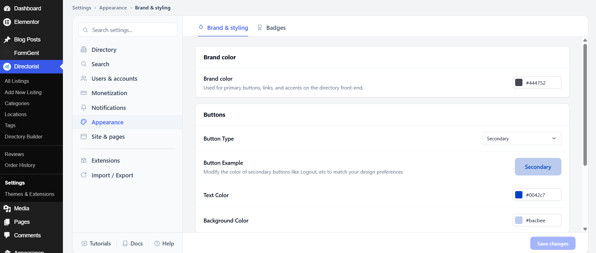
Brand color
Brand color is used for primary buttons, links, and accents on the directory front-end. The default is #444752 (dark gray). Change it to your primary brand color — for example, the color of your logo or main CTA button — and it will apply across the directory automatically.
Buttons
The Button Type setting controls the style of secondary buttons (such as Logout). The default is Secondary. If your theme has its own button styles, experiment with this setting to find what looks best.
Text Color sets the text color of secondary buttons. The default is #0042c7 (blue). Background Color sets the background of those buttons; the default is #bacbee (light blue). Adjust both to match your brand.
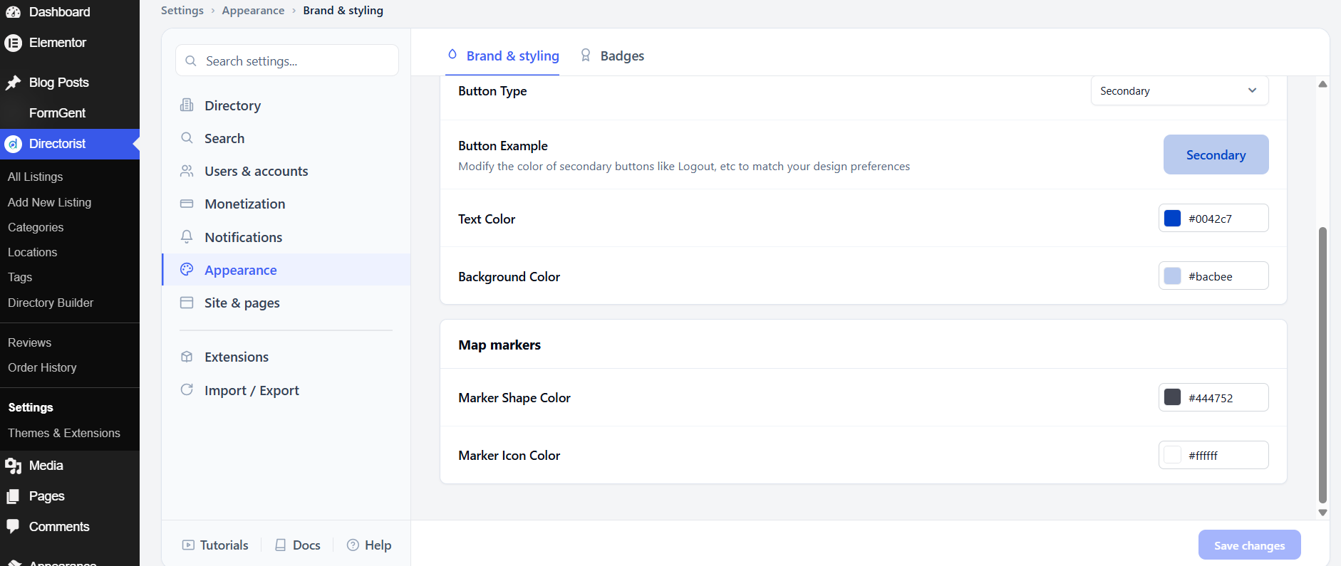
Map markers
Marker Shape Color sets the color of the map pin shape. The default is #444752. Marker Icon Color sets the color of the icon inside the pin. The default is #ffffff (white). Change these so your map pins match your brand color or stand out clearly on the map.
After adjusting these settings, click Save changes.
2. Badges #
Badges appear on listing cards to visually highlight a listing’s status — whether it’s newly added, gaining popularity, or manually featured. They help visitors quickly spot standout listings without reading every detail.
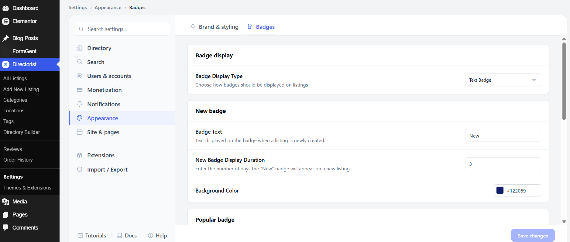
Badge Display Type
The Badge Display Type setting controls how all badges look across your directory. Choose Text Badge to show a small colored label with text (for example, “New” or “Popular”) — this is the default. Choose Icon Badge to show a small icon instead of text. Use text badges for clear, readable labels; use icon badges for a more minimal look.
New Badge
The New Badge appears automatically on listings for a set number of days after they are first published. It helps visitors find the freshest content in your directory.
Badge Text is the label shown on the badge. The default is New. You can change it to anything that fits your tone, such as “Just Added” or “Recent.”
New Badge Display Duration is how many days the badge stays visible after a listing is created. The default is 3 days. Set a higher number if you want listings to stay marked as “new” for longer, or lower it if your directory updates frequently.
Background Color is the badge’s background color. The default is #122069 (dark blue). Click the color field to open a color picker and choose a color that fits your brand.
Popular Badge
The Popular Badge appears on listings that meet a popularity threshold you define. It draws attention to the listings your visitors engage with most.
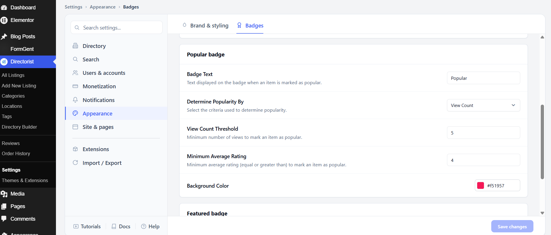
Badge Text is the label shown on the badge. The default is Popular.
Determine Popularity By sets the metric Directorist uses to decide whether a listing is popular. Choose View Count to mark a listing as popular once it reaches the view threshold you set below. Choose Average Rating to mark it as popular once its review score reaches the minimum you set below.
View Count Threshold only applies when Determine Popularity By is set to View Count. A listing must reach this many views before the badge appears. The default is 5.
Minimum Average Rating only applies when Determine Popularity By is set to Average Rating. A listing must have an average star rating equal to or higher than this number. The default is 4.
Background Color is the badge’s background color. The default is #f51957 (red/pink).
Featured Badge
The Featured Badge appears on listings that have been manually marked as featured — either by an admin or through a paid featured listing plan.
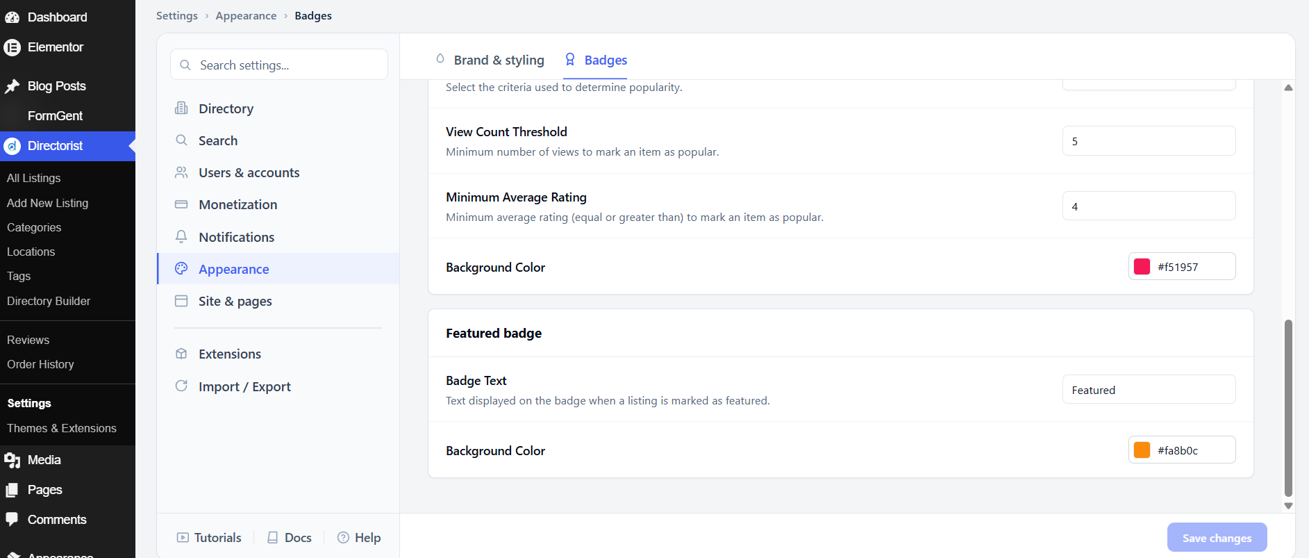
Badge Text is the label shown on the badge. The default is Featured.
Background Color is the badge’s background color. The default is #fa8b0c (orange).
After adjusting these settings, click Save changes.


