 Up to 35% Off!

This guide walks through every screen and setting in Directorist App 2.0 — from first sign-in to configuring the full app experience for your users. Follow the sections in order for initial setup, or jump to a specific section when you need it.
Throughout this guide you’ll see screenshots taken directly from the app so you know exactly what to look for on each screen.
What’s New in App 2.0 #
Directorist App 2.0 is has comes up with a significant step up. Here’s what changed — and why it matters for your business:
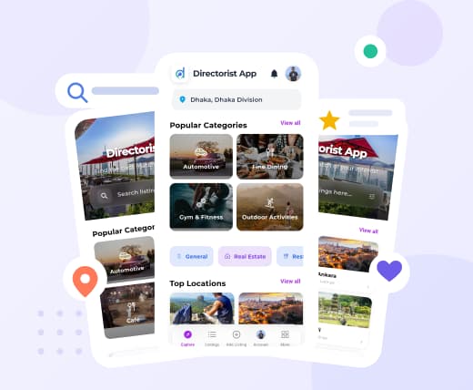
Fresh modern designs across multiple themes. The entire app has been redesigned with cleaner layouts, better visual hierarchy, and multiple theme options. It looks and feels like a premium app — because it is one. And here’s the part that turns heads: you can switch the whole app’s look instantly from your dashboard, with no new app store release needed. Running a seasonal campaign? Update the theme. Rebranding? Done in one tap.
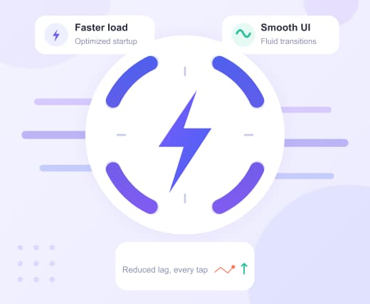
Significantly faster performance. App 2.0 loads faster, scrolls smoother, and cuts the lag that frustrates mobile users. When users move quickly — opening listings, jumping back to results, checking the map — the app keeps up. Faster means more listings viewed, more actions taken, and fewer drop-offs.
Cleaner navigation with fewer dead ends. The navigation has been redesigned from scratch. Users can move between listings, categories, filters, and maps without getting lost or confused. A cleaner user journey means more people reach the listings they’re looking for — and more of them take action.
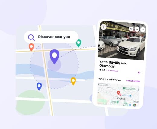
Enhanced map and location discovery. Location-based browsing is a core part of most directory use cases — restaurants, services, real estate, doctors. App 2.0 brings improved map rendering, better interactivity, and tighter radius-based filtering. Users searching for something “near me” will find what they’re looking for faster.
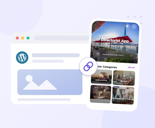
WebFallback / WebView support. You’ve put real effort into your WordPress site — blog posts, city guides, policy pages, promotional content. You shouldn’t have to rebuild all of that for an app. With WebView support, users can access your WordPress pages and posts directly inside the app without being pushed out to a browser. Your content stays connected, and the experience stays branded.
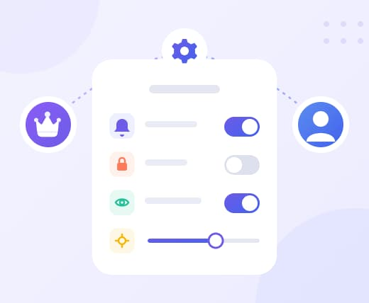
More settings control for you and your users. Directory owners now have expanded configuration options to shape how the app works. Users also get more control over their personal preferences. More control on both ends means a better experience all around — without needing to involve a developer every time something needs adjusting.
Getting Into the App #
The first screen your users — and you — will encounter after opening the app is the authentication modal. It slides up from the bottom and gives two options: Sign In for existing accounts, and Sign Up to create a new one.
1.1 Sign In #
Use this screen if you already have an account registered on the directory.
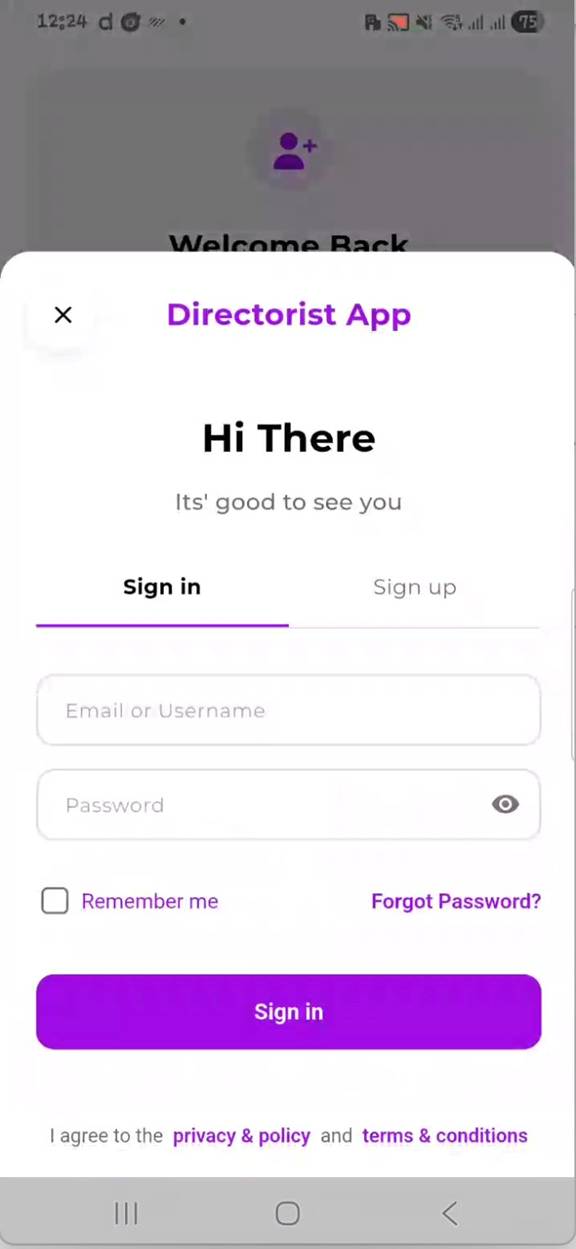
Sign In screen — enter your credentials and tap Sign In to access your account.
How to Sign In #
- Open the app. The authentication modal appears automatically if you are not logged in.
- The Sign In tab is selected by default. If not, tap Sign In at the top.
- Enter your Email or Username in the first field.
- Enter your Password. Tap the eye icon on the right to show or hide the characters.
- Check Remember me if you want the app to keep you signed in across sessions.
- Tap the purple Sign In button.
📝 Note: Forgot your password? Tap Forgot Password? on the Sign In screen. You will receive a reset link at your registered email address.
💡 Tip: If you own the directory and use the same account you use to manage your WordPress dashboard, you can sign in with those same credentials here. Owner can choose whether the login screen appears at the very beginning of the app, meaning users must log in before accessing the app
1.2 Sign Up #
New users who do not yet have an account on the directory use the Sign Up screen to register.
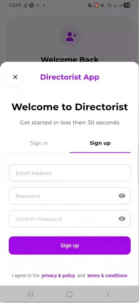
Sign Up screen — fill in email and password details, then tap Sign Up to create an account.
How to Sign Up #
- On the authentication modal, tap the Sign Up tab at the top right.
- Enter a valid Email Address in the first field.
- Enter a Password. Tap the eye icon to toggle visibility.
- Re-enter the same password in the Confirm Password field.
- Tap the purple Sign Up button.
📝 Note: By signing up, users agree to the Privacy & Policy and Terms & Conditions linked at the bottom of the screen. These pages pull from your directory’s configured legal pages.
📝 Note: As a directory owner, you control whether registration is open to the public. This is managed under App UI Configuration → General → Core Settings. If Allow Registration is turned off, new users will not be able to create accounts through the app.
Account Settings #
After signing in, directory owners and users can manage their profile and account preferences from the Account section. Access it by tapping Account in the bottom navigation bar or from the More menu, depending on your navbar configuration.
The Account section contains four sub-screens: Personal Information, Change Password, Social Profile, and Notification Settings.
2.1 Personal Information #
This screen stores the basic profile details for your account. Changes saved here are written directly to your WordPress user profile via the API.
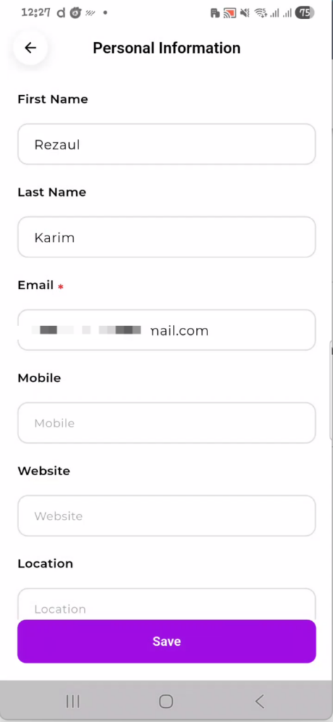
Personal Information screen — update your name, email, contact details, and location.
How to Update Personal Information #
- Navigate to Account and tap Personal Information.
- Update any of the editable fields (see table below).
- Tap the purple Save button at the bottom to confirm changes.
| Field | Description |
| First Name | Your given name. Displayed on your public profile if enabled. |
| Last Name | Your family name. |
| Required. This is your login identifier. Changes apply immediately. | |
| Mobile | Optional contact number. Visible to directory admins. |
| Website | Optional personal or business URL. |
| Location | Optional. Helps surface location-relevant content on your account. |
📝 Note: Make sure to tap the Save button to apply your changes. If you close or restart the app before saving, any updates you typed will be lost and won’t sync to the website.
2.2 Change Password #
Use this screen to update your account password at any time. You must know your current password to make a change.
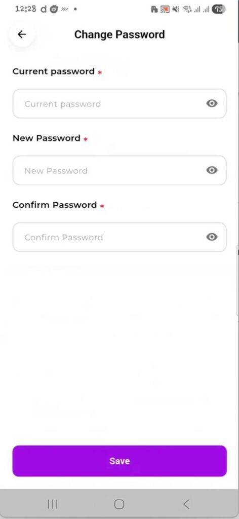
Change Password screen — enter your current password, then set and confirm a new one.
How to Change Your Password #
- Navigate to Account and tap Change Password.
- Enter your Current password in the first field.
- Enter your New Password. Use the eye icon to check what you’re typing.
- Re-enter the same new password in the Confirm Password field.
- Tap the purple Save button.
📝 Note: All three fields marked with a red asterisk (*) are required. The form will not submit if any are empty or if the new password and confirmation do not match.
💡 Tip: For security, choose a password that is at least 8 characters long and includes a mix of letters, numbers, and symbols.
2.3 Social Profile #
Add links to your social media profiles here. These links are attached to your account and may appear on your public-facing directory profile depending on your directory’s configuration.
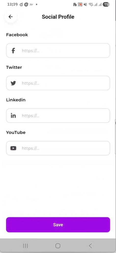
Social Profile screen — add URLs for Facebook, Twitter, LinkedIn, and YouTube.
How to Add Social Profile Links #
- Navigate to Account and tap Social Profile.
- Paste the full URL (starting with https://) into the relevant platform field.
- Fill in as many or as few platforms as you like. All fields are optional.
- Tap the purple Save button to store your links.
| Field | Description |
| Full URL to your Facebook page or profile. | |
| Full URL to your Twitter/X profile. | |
| Full URL to your LinkedIn profile or company page. | |
| YouTube | Full URL to your YouTube channel. |
📝 Note: These social links are separate from any social links you may have set on individual directory listings. Listing-level social links are managed from the listing creation or editing screen.
2.4 Notification Settings #
Control which types of notifications the app sends to your device. Each category can be toggled on or off independently.
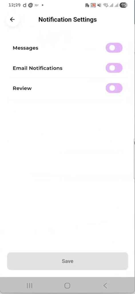
Notification Settings screen — toggle Messages, Email Notifications, and Reviews on or off.
How to Manage Notification Settings #
- Navigate to Account and tap Notification Settings (or Push Notifications).
- Use the toggle switches to enable or disable each notification type.
- Tap Save at the bottom to apply your preferences.
| Setting | Default | What It Does |
| Messages | On | Notifies you when another user sends you a direct message through the directory. |
| Email Notifications | On | Controls whether transactional notification emails (from your directory) are sent alongside push alerts. |
| Review | On | Notifies you when a new review is submitted on one of your listings. |
📝 Note: These preferences are per-user and per-device. They do not affect system-level notification permissions — to fully enable or disable app notifications, users must also allow them in their phone’s system settings (iOS Settings → Notifications or Android Settings → Apps → Notifications).
💡 Tip: As a directory owner, keeping Reviews and Messages notifications on means you’ll be alerted immediately when users interact with your listings — helping you respond faster.
App UI Configuration #
App UI Configuration is the central control panel for directory owners. It lets you customize how the app looks and behaves for all your users — with no code changes required. Every change you save here is applied across the app immediately.
Access it from: Account → App UI Configuration (or from the More menu if configured there).
App UI Configuration — tab navigation showing General, Home, Navbar, Single Listing (and more when scrolled).
The configuration panel is divided into tabs across the top. Swipe left on the tab bar to reveal additional tabs. The full list of tabs is:
- General — Core settings, splash screen, access control, and branding
- Home — Home screen layout, banner, and featured section settings
- Navbar — Bottom navigation bar items and order
- Single Listing — What appears on an individual listing detail page
- All Listing — Controls for the listings browse/search screen
- More — Additional menu links and custom pages
📝 Note: The Save button appears in the top-right corner of every tab. Changes are only applied after tapping Save. Switching tabs without saving will discard unsaved changes on the tab you were on.
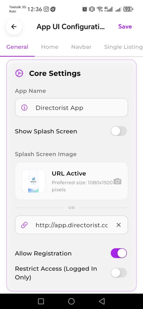
3.1 General Tab #
The General tab is the first tab in App UI Configuration. It contains the Core Settings that control fundamental app behavior — your app name, splash screen, registration rules, and access control.
General tab — Core Settings showing App Name, Splash Screen, and access control toggles.
3.1.1 Core Settings #
These settings define basic identity and access rules for the entire app.
| Setting | Default | What It Does |
| App Name | — | The internal name of your app instance. This is displayed in the configuration panel header. Set this to match your directory’s brand name. |
| Show Splash Screen | Off | When enabled, a custom splash screen is displayed while the app loads. Useful for branding. When off, the app goes straight to the home screen. |
| Splash Screen Image | — | Upload a custom splash screen image (recommended size: 1080×1920 pixels). You can upload an image file directly or enter a URL. Both options appear on screen — only one is used at a time. |
| Allow Registration | On | When on, new users can create accounts via the Sign Up screen. Turn this off to make the app invite-only or closed to public registration. |
| Restrict Access (Logged In Only) | Off | When enabled, users must be signed in to browse the app. Unauthenticated visitors will be redirected to the Sign In screen instead of seeing listings. |
The remaining sub-sections of General — Banner Settings, Branding, Topbar Header, Auth Greetings, and App Links — will be covered once additional screenshots are provided. Continue to the next set of screenshots to complete this section.
Scrolling down the General tab reveals four more setting groups beneath Core Settings: Banner Settings, Branding, Topbar Header, Auth Greetings, and App Links. Each is documented below.
3.2 Banner Settings #
Banner Settings control the large hero banner that appears at the top of your app home screen. This is the first visual impression users see when they open your app, so getting the title, subtitle, and image right matters.
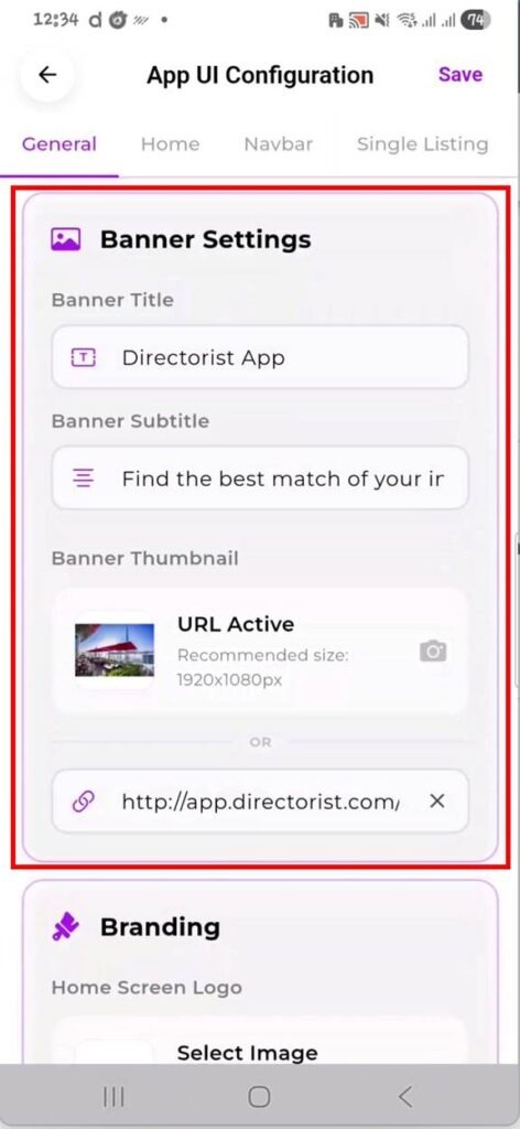
Banner Settings — configure the home screen hero banner title, subtitle, and background image.
| Field | Description |
| Banner Title | The main heading displayed over the banner. Replace the default “Directorist App” with your directory’s name (e.g. “Find the Best Restaurants in NYC”). |
| Banner Subtitle | The supporting line beneath the title. Defaults to “Find the best match of your interest.” Customize this to describe what your directory does. |
| Banner Thumbnail | The background image for the hero banner. Recommended size: 1920×1080px. Upload an image directly using the camera icon, or paste an image URL in the link field. When a URL is active, “URL Active” is shown alongside a thumbnail preview. |
Note: These changes will apply on Header style 1
Tip: Use a high-quality wide image that works well with text overlaid on top. Avoid cluttered images — the title and subtitle sit on top of this image, so clear skies, solid backgrounds, or slightly blurred lifestyle photos work best.
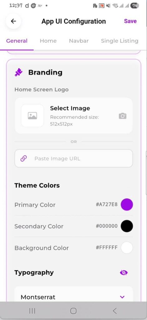
3.3 Branding #
The Branding section is where you set your app’s logo and define the color scheme used throughout the entire app. Every button, icon highlight, and accent color in the app pulls from these settings.
Branding — upload your logo, set primary and secondary colors, and choose the app font.
| Field | Description |
| Home Screen Logo | Your brand logo displayed in the app header. Recommended size: 512×512px. Upload a file or paste a URL. PNG with transparent background works best. |
| Primary Color | The main accent color — used for buttons, active states, highlights, and interactive elements. Set this to your brand’s primary color. Enter a hex code or tap the color circle to use the color picker. |
| Secondary Color | Used for secondary UI elements and text accents. Defaults to black (#000000). Adjust this to complement your primary color. |
| Background Color | The app’s base background color. Defaults to white (#FFFFFF). Only change this if your brand uses a non-white background. |
| Typography (Font) | The typeface used across all text in the app. Defaults to Poppins. Tap the dropdown to select from available font options. |
Note: Primary Color changes apply globally and immediately after saving. If your brand uses a very light primary color, check that text on buttons remains readable — dark text on light buttons may need a secondary color adjustment.
The selected logo will be applied to the app headers. For Typography (Font), the default font is Poppins
Tip: To find your brand’s exact hex code, check your website’s CSS, brand style guide, or use a color picker browser extension on your directory site.
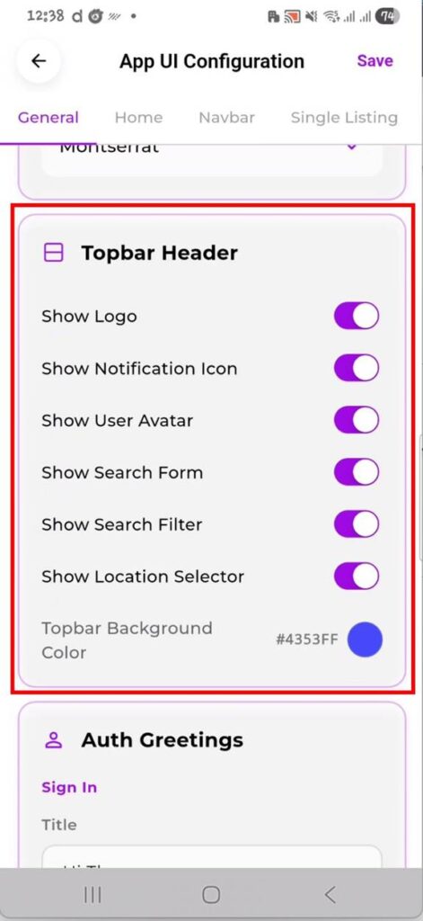
3.4 Topbar Header #
The Topbar Header controls what appears in the fixed bar at the very top of every app screen — your logo, notification bell, user avatar, search bar, search filter, location selector, and the topbar background color.
Topbar Header — toggle each topbar element on or off and set the background color.
| Setting | Default | What It Does |
| Show Logo | On | Displays your brand logo in the top-left of the topbar. Pulls the logo set in Branding. Turn off if you prefer a text-only header. |
| Show Notification Icon | On | Shows the bell icon in the topbar. Users tap this to view their notification history. Disable if push notifications are not configured for your directory. |
| Show User Avatar | On | Displays the logged-in user’s profile picture in the topbar. Tapping it navigates to the Account screen. |
| Show Search Form | On | Renders the search input bar in the topbar. This is the primary way users search listings. Disabling it removes search from the topbar entirely. |
| Show Search Filter | On | Adds a filter icon next to the search form. Tapping it opens advanced filter options (category, location, etc.). Disable to simplify the search experience. |
| Show Location Selector | On | Shows a location detection button in the topbar. Users tap it to set their current location for proximity-based listing results. |
| Topbar Background Color | #4353FF | The background color of the fixed topbar. Tap the color swatch to open the color picker. Set this to match your brand or directory theme. |
Note: The Topbar Background Color is separate from the Primary Color in Branding. You can have a different topbar color from your button/accent color — useful if your primary color is too light or dark for a full-width topbar background.
3.5 Auth Greetings #
Auth Greetings lets you customize the headline and subtitle text that appears on the Sign In and Sign Up modal screens. By default these show generic text — replace them with language that fits your directory’s tone and brand voice.
Auth Greetings — set custom titles and subtitles for both the Sign In and Sign Up screens.
| Field | Description |
| Sign In → Title | The bold heading on the Sign In screen. Default: “Hi There”. Example replacement: “Welcome Back” or “Sign In to [Your Directory Name]”. |
| Sign In → Subtitle | The supporting line below the Sign In title. Default: “It’s good to see you”. Customize to match your brand’s voice. |
| Sign Up → Title | The bold heading on the Sign Up screen. Default: “Welcome to Directorist”. Replace with your own directory name, e.g. “Welcome to LocalFind”. |
| Sign Up → Subtitle | The supporting line below the Sign Up title. Default: “Get started in less than 30 seconds”. Keep it short and action-oriented. |
Tip: These greetings are often the first branded text a new user reads. Make them warm and welcoming. Keep titles under 5 words and subtitles under 8 words for the best visual fit on the modal.
3.6 App Links #
App Links are the URLs that power three important in-app destinations: the Support Centre, Terms & Conditions page, and Privacy Policy page. When users tap these from the app’s More menu or account screen, these links open the corresponding pages.
App Links — set the URLs for Support, Terms & Conditions, and Privacy Policy.
| Field | Description |
| Support Link | The URL that opens when a user taps “Support Centre” in the app. Set this to your help desk, support page, or contact form URL (e.g. https://yourdirectory.com/support). |
| Terms & Conditions Link | The URL for your Terms & Conditions page. This also appears as a link on the Sign Up screen. Leave blank to use the default or your platform URL. |
| Privacy Policy Link | The URL for your Privacy Policy page. Like T&C, this is linked from the Sign Up screen. Must be a publicly accessible URL. |
Note: Both Terms & Conditions and Privacy Policy links appear in the Sign Up screen footer (“I agree to the privacy & policy and terms & conditions”). If these fields are left blank, the links will not resolve correctly. Always fill these in before your public launch.
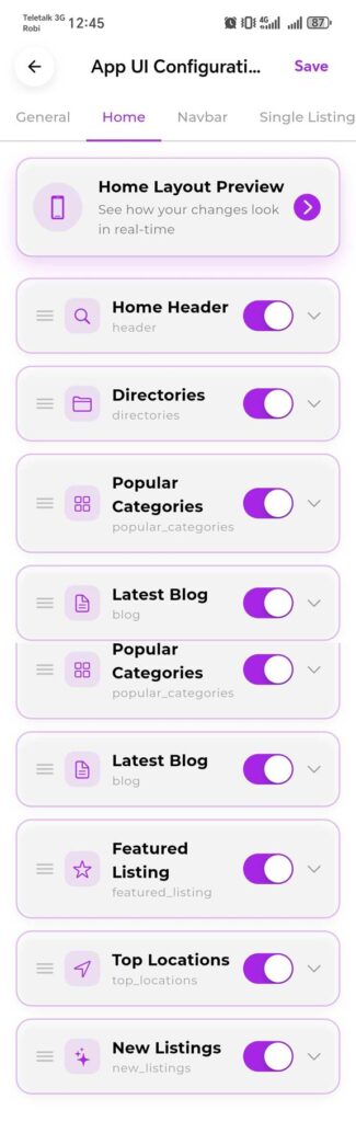
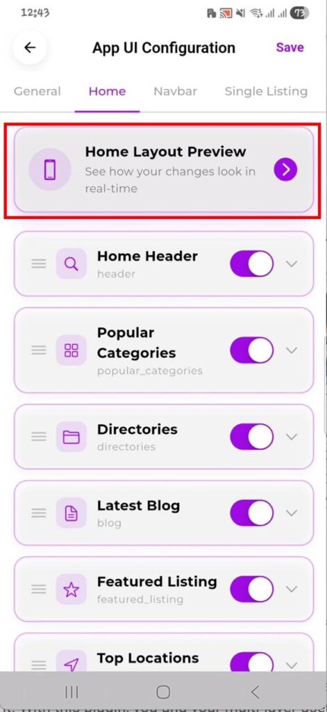
Home Tab #
The Home tab in App UI Configuration controls every section that appears on your app’s home screen — what shows, in what order, and in what style. You can toggle sections on or off, reorder them by dragging, and choose display styles per section.
Changes here affect all users of your directory app. Use the Home Layout Preview button at the top to see a live preview of your configuration before saving.
Home tab — full list of home screen sections with toggle controls and drag handles for reordering.
Home Layout Preview button — tap the arrow to open a real-time preview of how your home screen looks with current settings applied.
Home Header expanded — showing Active Style, Hide Label toggle, and Choose Style dropdown for selecting among available header layouts.
How the Home Tab Works #
- Tap the Home tab in App UI Configuration.
- Tap “Home Layout Preview” at the top to open a real-time preview alongside your settings.
- Toggle any section on or off using the toggle switch on the right.
- Drag the three-line handle on the left of any section to reorder it up or down the page.
- Tap the chevron (down arrow) on a section to expand its individual style and display options.
- Choose an available style using the “Choose Style” dropdown inside the expanded section.
- Tap Save in the top-right corner to apply all changes.
Home Screen Sections #
The following sections can be shown or hidden on the home screen:
| Setting | Default | What It Does |
| Home Header | On | The search bar and header block at the very top of the home screen. Supports multiple layout styles. Use “Choose Style” to switch between them. Hide Label removes the section heading. |
| Popular Categories | On | A grid or row of your directory’s categories with icons or images. Supports multiple styles (e.g. Style 4 with Double Line mode). Double Line stacks the category name over two lines. |
| Directories | On | Shows a list or grid of your directory types if you have multiple directories configured in Directorist. |
| Latest Blog | On | Displays your most recent WordPress blog posts from your directory site. Requires blog posts to be published on the connected WP site. |
| Featured Listing | On | A highlighted section showing listings marked as Featured in your WordPress directory dashboard. |
| Top Locations | On | Shows locations with the most listings — useful for location-based directories like city guides or regional business directories. |
| New Listings | On | Displays the most recently added listings on your directory. |
Note: The order of sections in the Home tab list is the exact order they appear on the home screen. Drag sections to rearrange them. Sections that are toggled off are hidden from users but not deleted — you can re-enable them at any time.
Tip: Start with only the sections relevant to your directory type. A restaurant directory may not need “Top Locations” prominently, while a city guide directory might want it as the second section right after the header.
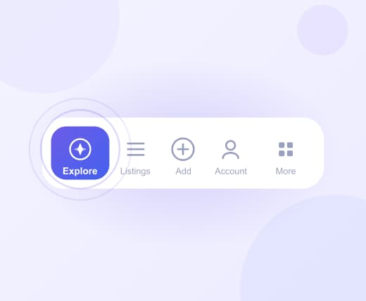
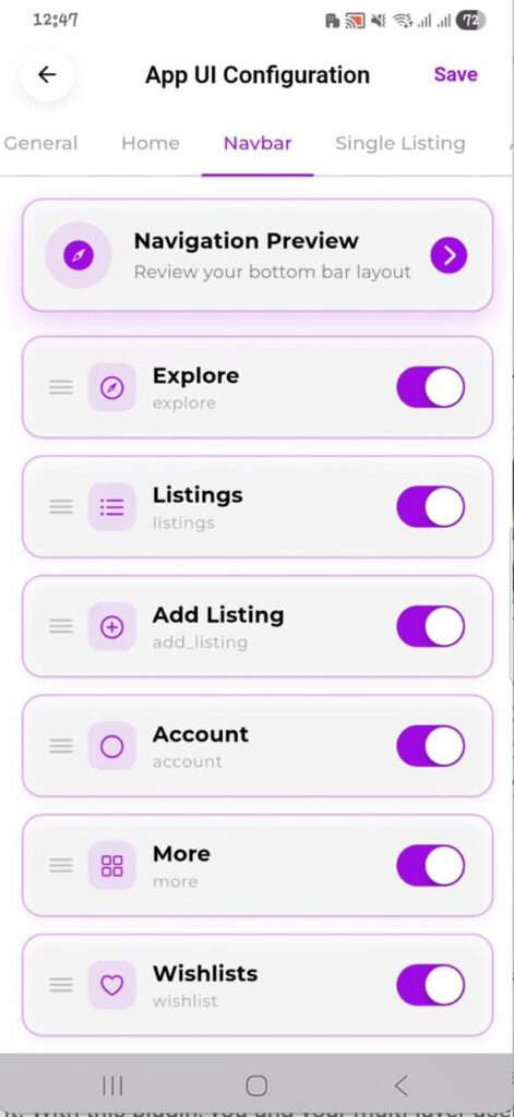
Navbar Tab #
The Navbar tab controls the bottom navigation bar of your app — the row of icons at the very bottom of every screen. You can choose which items appear, hide ones you don’t need, and reorder them to suit your directory’s priorities.
Tap “Navigation Preview” at the top to see a live preview of the bottom bar before saving.
Navbar tab — toggle and reorder bottom navigation items including Explore, Listings, Add Listing, Account, More, and Wishlists.
How the Navbar Tab Works #
- Tap the Navbar tab in App UI Configuration.
- Tap “Navigation Preview” to open a real-time preview of the bottom bar layout.
- Toggle any nav item on or off with its toggle switch.
- Drag the three-line handle on the left to reorder items. The order here is the order they appear left to right in the bottom bar.
- Tap Save to apply changes.
Available Navigation Items #
| Setting | Default | What It Does |
| Explore | On | The home/discover screen showing your directory’s home layout. This is typically the first tab users land on. Recommended to keep this on and first in the order. |
| Listings | On | The browse screen showing all directory listings with search and filter. Core navigation for most directories. |
| Add Listing | On | Opens the listing submission wizard, allowing users to submit a new listing directly from the bottom bar. Turn off if you want to restrict listing creation to the web dashboard only. |
| Wishlists | On | Lets users save listings to a personal wishlist for later reference. Particularly useful for hotel, restaurant, or even |
| Account | On | The user account screen — profile, settings, notifications, etc. Keep this on for all directories that require user login. |
Note: The bottom navigation bar displays a maximum of 5 tabs at any time. The app determines which tabs to show based on these automatic rules:
Smart Fill & Order: The app looks at all active, visible tabs and shows the 5 tabs with the lowest order numbers. If a higher-priority tab gets automatically hidden (e.g., the user cannot add listings), the next active tab in line (such as Account) will automatically slide up to fill the empty slot.
Automatic Hiding:
The Add Listing tab will automatically hide for users who do not have permission to submit listings.
The More tab will automatically hide if you haven’t added any custom sections to it, even if you set it to active in your settings.
Tip: Put your most-used action in the center position — typically “Add Listing” for listing-heavy directories or “Explore” for browsing-focused ones. Users naturally tap the center item most.
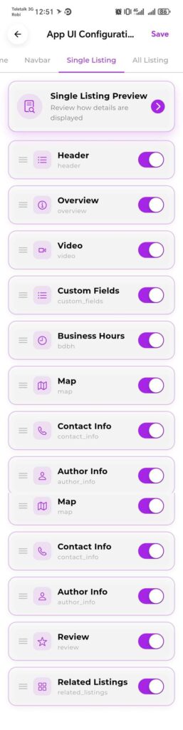
Single Listing Tab #
The Single Listing tab controls what information blocks appear when a user opens an individual listing detail page. You can show or hide each block, and reorder them to control the visual hierarchy of listing content.
Tap “Single Listing Preview” at the top to see a real-time preview of a listing page with your current settings applied.
Single Listing tab — all listing detail page blocks with individual toggles and drag handles for reordering.
How the Single Listing Tab Works #
- Tap the Single Listing tab in App UI Configuration.
- Tap “Single Listing Preview” to see the current layout on a real listing page.
- Toggle any block on or off using its toggle switch.
- Drag the three-line handle on the left to reorder blocks — the order here is the order content appears on the listing page, top to bottom.
- Tap Save to apply all changes.
Available Listing Detail Blocks #
| Setting | Default | What It Does |
| Header | On | The top section of the listing page — typically the listing title, primary image/gallery, category, and key tags. This should almost always remain on. |
| Overview | On | A general description or summary section of the listing. Usually shows the listing description text and basic info like address and rating. |
| Video | On | Displays an embedded video if the listing owner has added a video URL. Only appears on listings that have a video attached. Safe to leave on — it simply won’t show on listings without a video. |
| Custom Fields | On | Shows any custom fields configured in your Directorist WordPress dashboard for the listing type (e.g. price range, dress code, parking, amenities). |
| Business Hours | On | Displays the business hours block — including open/close times per day and the current open/closed status. Powered by the business hours selector in the listing creation wizard. |
| Map | On | An interactive map showing the listing’s location. Users can tap it to get directions. Turn off for directories where location is not relevant (e.g. remote services). |
| Contact Info | On | Phone, email, website, and social links for the listing. Essential for most directory types. |
| Author Info | On | Shows the name and profile of the user who submitted the listing. Useful for marketplaces or directories where knowing the submitter matters. |
| Review | On | The reviews and ratings section — shows existing reviews and the form for users to submit new ones. Turn off to disable reviews on single listing pages. |
| Related Listings | On | A section below the main content showing other listings in the same category. Helps users discover more relevant results. |
Note: Map, Contact Info, and Business Hours blocks only display data if the listing owner filled in those fields during submission. If a field is empty, the block is either hidden automatically or shows a placeholder depending on your Directorist configuration.
Tip: For service-based directories (freelancers, consultants, online businesses), consider turning off the Map block and moving Contact Info and Review higher in the order so users reach them without scrolling past a map of an irrelevant location.
SECTION 7
All Listing Tab #
The All Listing tab controls the listings browse screen — the page users see when they tap “Listings” in the bottom navbar or perform a search. You can set the default view type, choose the listing card style, and toggle the map view button.
All Listing tab — toggle the map button, set the default view type (Grid or List), and choose the listing card style.
Settings on the All Listing Tab #
| Setting | Default | What It Does |
| Show Map Button | On | Adds a map toggle button on the listings browse screen. When users tap it, listings switch from card view to a map view with pins. Turn off for directories where location is not a primary discovery method. |
| Default View Type | Grid View | Sets whether the listings browse screen opens in Grid View (card grid) or List View (vertical list) by default. Users can switch between the two if both are available. Choose the layout that best suits your listing content — Grid works well for visual listings (restaurants, hotels), List works well for text-heavy ones (services, classifieds). |
| Available Styles | Style 1 | The card design used for each listing in the browse screen. Tap “Choose Style” to expand the style picker. “Style 1 — Currently Active” is shown with a radio button and an eye icon to preview the style. Select a different style to change the listing card layout across the browse screen. |
Note: The “All Listing Layout Preview” button at the top of this tab opens a real-time preview of the browse screen with your current settings applied. Use it after changing the view type or style to confirm the result before saving.
Tip: Grid View with a visual-heavy card style works best when your listings have good thumbnail images. If your directory has many listings without images, List View tends to look cleaner and more consistent.
More Tab #
The More tab controls the secondary menu screen that users reach by tapping “More” in the bottom navigation bar. This is where you add custom link sections, group related links under labels, and curate additional navigation beyond the five main navbar items.
It is structured as sections, each with a label and child items underneath. Sections and items can both be toggled, reordered, and deleted.
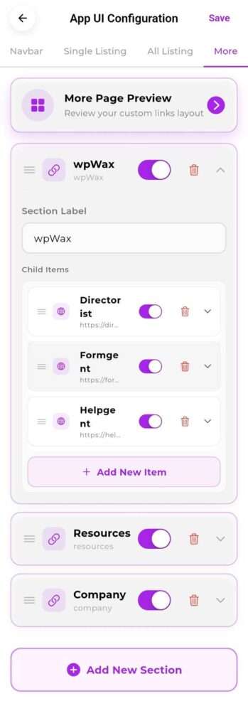
More tab — section groups with child link items, drag handles, toggle switches, and Add New Item / Add New Section controls.
How the More Tab is Structured #
- Sections — top-level groups with a label (e.g. “wpWax”, “Resources”, “Company”). Each section appears as a heading in the More menu screen.
- Child Items — individual links inside a section (e.g. Directorist, Formgent, Helpgent under the wpWax section). Each child item has a name, a URL, an icon, a toggle, and a delete button.
How to Manage the More Tab #
Adding a New Section #
- Scroll to the bottom of the More tab and tap “+ Add New Section”.
- Enter a Section Label — this is the heading users see in the More menu.
- Toggle the section on to make it visible in the app.
- Tap Save.
Adding a Child Item to a Section #
- Expand a section by tapping its chevron (down arrow) on the right.
- Tap “+ Add New Item” inside the section.
- Enter the item name and its destination URL.
- Choose an icon
- Toggle the item on to make it visible.
- Tap Save.
Reordering Sections and Items #
- Press and hold the three-line drag handle on the left of any section or child item.
- Drag it up or down to the desired position.
- Release and tap Save.
Deleting a Section or Item #
- Tap the red trash icon on the right of the section or item you want to remove.
- Confirm if prompted, then tap Save.
Controls on Each Section/Item #
| Field | Description |
| Drag Handle (≡) | Three horizontal lines on the left. Press and hold to drag the section or item to a new position. |
| Icon | Displayed next to the item name in the More menu. The icon shown here (e.g. globe/chain link) is set per item. |
| Name | The visible label for the section or link item. Edit this to customize what users see. |
| Toggle Switch | Purple = visible in the app. Grey = hidden. Items can be kept in the list but hidden without deleting them. |
| Delete (trash icon) | Permanently removes the section or item. This cannot be undone. |
| Chevron (∧ / ∨) | Expands or collapses the section to show or hide its child items and configuration fields. |
| Section Label field | The editable text field inside an expanded section where you type the section heading. |
| Child Items list | Shows all links nested inside a section. Each has its own toggle, drag handle, and delete button. |
| + Add New Item | Adds a new link item inside the section. |
| + Add New Section | Adds a new top-level section group at the bottom of the More menu. |
Note: The “More Page Preview” button at the top of this tab opens a preview of exactly how the More menu screen will look with your current sections and items. Always check the preview before saving, especially after reordering or adding new sections.
Tip: Keep the More menu focused. 2–4 sections with 2–5 items each is a comfortable amount. A long, uncurated More menu makes the app feel cluttered. Link to things users genuinely need — support, about page, specific directory categories, or partner pages.
How to Add a Listing Owner #
A listing owner is any user who has an account on your directory and is permitted to submit, manage, and track listings through the app. There are two ways to add a listing owner — they can register themselves through the app, or you can create their account manually from your WordPress dashboard and share the credentials with them.
Method 1 — Self-Registration via the App #
This is the standard flow. The user downloads your app, opens it, and registers on their own. Once they submit their registration, their account is created in a pending state and must be approved by you from the WordPress dashboard before they can fully access the app.
Step 1 — User Registers Through the App #
- The user opens the app and taps the Account icon or any action that requires login.
- The authentication modal appears. They tap the Sign Up tab.
- They enter their Email Address, Password, and Confirm Password.
- They tap the Sign Up button.
- A confirmation is shown. Their account is now submitted and awaiting approval.
Important: The user cannot log in or use listing features until you approve their account from the WordPress dashboard. Make sure they are aware of this so they do not think the registration failed.
Step 2 — Approve the New User from WordPress Dashboard #
| WordPress Dashboard Path: WordPress Dashboard → Users → All Users |
- Log in to your WordPress dashboard.
- Go to Users → All Users from the left sidebar.
- Find the newly registered user. You can use the search bar at the top right to search by name or email.
- Click on the user’s name to open their profile.
- Review their details and confirm their account by setting their role to the appropriate level (e.g. Subscriber or any custom role you use for listing owners).
- Scroll down and click Update User to save.
Note: By default, new registrations through the app are created as WordPress Subscribers. If your directory uses a specific role for listing owners (such as a custom Directorist role), update it here before the user attempts to submit a listing.
Tip: To reduce manual approval overhead, you can enable automatic user approval in your Directorist or WordPress user settings — but review the security implications for your directory type before doing so.
Method 2 — Manually Create a User from WordPress Dashboard #
If you want to onboard a specific person as a listing owner without waiting for them to self-register, you can create their account directly from WordPress and provide them with their login credentials.
| WordPress Dashboard Path: WordPress Dashboard → Users → Add New |
- Log in to your WordPress dashboard.
- Go to Users → Add New from the left sidebar.
- Fill in the required fields:
- Username — A unique username for the account (cannot be changed later).
- Email — The user’s email address.
- First Name / Last Name — Optional but recommended.
- Password — Set a strong temporary password. Check “Send User Notification” to email them their credentials automatically.
- Role — Set to Subscriber or your directory’s designated listing owner role.
- Click Add New User to create the account.
- Share the app download link and their credentials (username + password) with the user so they can sign in immediately.
Note: If you check “Send User Notification”, WordPress sends the user an email with a link to set their own password. This is the cleanest approach — you create the account, they set their own password, and they use those credentials to sign in to the app.
Tip: For larger onboarding batches, use a WordPress plugin like “Add Multiple Users” to create accounts in bulk, then share credentials. All those users can sign in to the app with their WordPress credentials immediately.
How to Add a Listing #
Listings are the core content of your directory — businesses, services, places, or any other entries your directory is built around. Listing owners can submit new listings directly through the app using the built-in step-by-step listing wizard. Every submitted listing goes into a pending state and must be reviewed and approved by the directory owner before it appears publicly.
Part A — Submitting a Listing Through the App #
The listing owner follows these steps inside the app to submit a new listing for review.
Step 1 — Open the Add Listing Screen #
- The listing owner signs in to the app with their credentials.
- Tap the Add Listing icon in the bottom navigation bar (the + icon), or tap Add Listing from the More menu if configured there.
- The listing creation wizard opens.
Step 2 — Fill In the Listing Form #
The listing wizard is divided into steps. The listing owner moves through each step in sequence, filling in the required information. Typical steps include:
- Basic Information — Listing title, category, description.
- Location — Address, city, and map pin placement.
- Contact Details — Phone number, email address, website URL.
- Business Hours — Operating hours for each day of the week, including open/closed status per day.
- Media — Upload photos or add a video URL for the listing gallery.
- Custom Fields — Any additional fields configured for your listing type in Directorist (e.g. price range, amenities, tags).
- Social Links — Optional Facebook, Twitter, LinkedIn, or other profile links for the listing.
Note: Not all steps may appear — the fields shown in the wizard depend on what you have configured in your Directorist WordPress settings for that listing type. Only fields that are enabled in your Directorist form builder will appear here.
Step 3 — Submit the Listing #
- After completing all steps in the wizard, the listing owner taps the Submit button on the final step.
- A confirmation message appears indicating the listing has been submitted successfully.
- The listing is now in Pending status. It is not publicly visible yet.
Important: Submitting a listing through the app does not make it live immediately. Every listing goes into a pending queue and requires approval from the directory owner through the WordPress dashboard before it appears on the directory.
Part B — Approving the Listing from WordPress Dashboard #
As the directory owner, you receive a pending listing submission and must approve it before it goes live. This is done entirely from your WordPress dashboard.
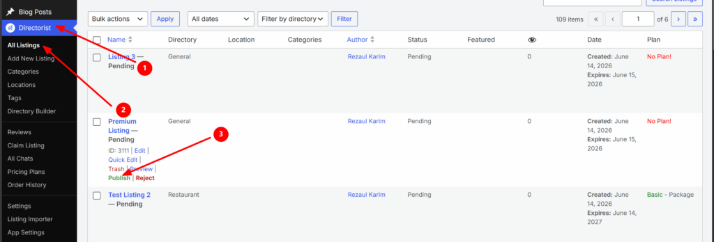
| WordPress Dashboard Path: WordPress Dashboard → Directorist → All Listings |
- Log in to your WordPress dashboard.
- Go to Directorist → All Listings from the left sidebar.
- Find the submitted listing. Pending listings are filtered under the Pending tab at the top of the listings table — click it to view only pending submissions.
- Click on the listing title to open it and review the submitted content — title, description, location, photos, contact info, business hours, and any custom fields.
- If the listing meets your directory’s standards, click Approve (or change the status from Pending to Published using the Status dropdown in the listing editor).
- Click Update to save. The listing is now live and publicly visible on your directory — both on the website and in the app.
Note: If a listing does not meet your quality standards, you can reject it, delete it, or leave it in pending and contact the listing owner directly to request corrections. There is currently no in-app notification to the listing owner when their listing is approved or rejected — communicate this via email or through your directory’s messaging system.
Tip: Set up a routine to check pending listings daily or weekly so listing owners are not left waiting too long for approval. Long approval delays are a common reason listing owners lose interest in a directory.
Part C — Checking Listing Status in the App #
After submitting a listing, the listing owner can track its status directly from the app without needing to contact you. The app’s user dashboard shows the current status of all listings associated with their account.
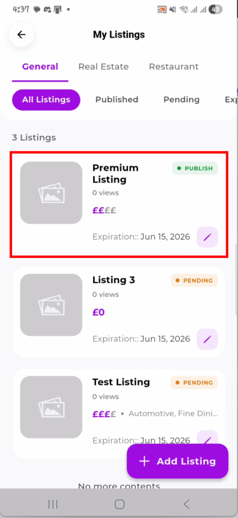
How to Check Listing Status #
- The listing owner taps Account in the bottom navigation bar.
- Tap My Listings from the account menu.
- The My Listings screen shows all their submitted listings grouped by status:
- All Listings — Every listing associated with the account regardless of status.
- Published — Listings that have been approved and are currently live on the directory.
- Pending — Listings that have been submitted and are awaiting approval from the directory owner.
- Expired — Listings whose plan or validity period has ended and are no longer publicly visible.
Note: The listing status in the app updates automatically once you approve or change the status in your WordPress dashboard. The listing owner does not need to refresh or do anything — the next time they open My Listings, the updated status will be reflected.
Tip: Encourage your listing owners to check the Pending tab in My Listings after submitting. This confirms their submission went through successfully and sets clear expectations that approval is a manual step on your end.


